Black Duveen

Painting framed on a white wall in a studio room

OVERVIEW

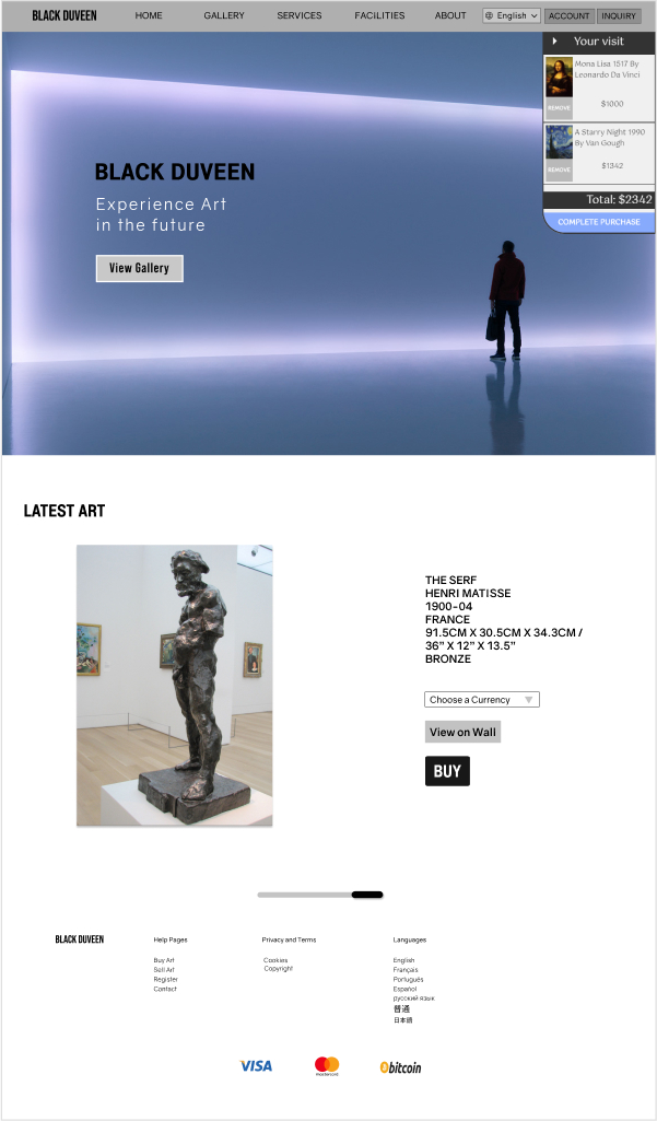
Black Duveen is a private art brokerage website for buying and selling high valued international art. The experience revolves around having a personal concierge of an art brokerage as an integral part of the provided service to the users. Alongside enrich the user in a quasi-3D viewing room experience. The procurement services includes delivery or storage options of the art. The intended audience pertains to avid art seekers, those who might be travelling around the world who can’t visit a brokerage in person.

ROLE

UI / UX Lead Designer

UI, UX

4 month internship

BACKGROUND

I was brought into a group at Evolve Branding’s internship program: Evolve X as the lead UX Designer. The members consisted of two other developers under the instruction of a project lead who would be the main line of contact with the clients to share the vision they had. My role entered as the main source of design and structure to help guide the team.

GOAL

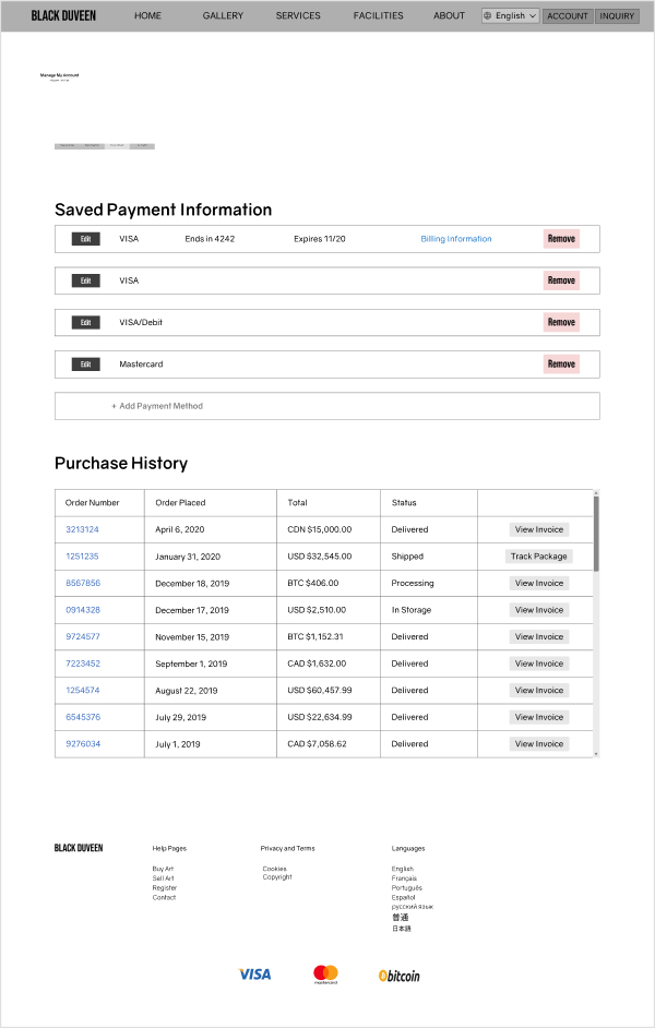
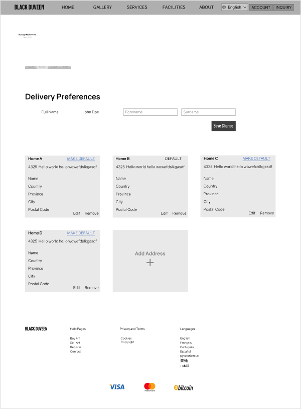
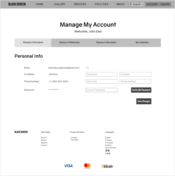
Establish a site identity and website that allows people to browse artwork and handle a customer portal for inquiries.

Research

To better understand the competition and market, I conducted an analysis on two competitors. Both competitors served as a direct and indirect types that offered similar services and related product. While either party had an expertise in what they offered, there was a missing gap of presentation in which Black Duveen strived to show.

Keep it simple

The viewing experience is new in itself as it transitions into the online web space. Some users may not be adept with navigation and context clues. Presenting the essential details of what they need will be the key to a great design.

Give them a goal

One competitor offered an immense and valuable amount of information, but left their users with nothing to do afterwards. Guiding users in a scenario will help gain clarity on what core features to focus on.

Be there for support

Every competitor had a method of contact, whether it be an email system or phone number to be reached at. Showing the availability provides a sense of help in times of need when a person wants further information.

Design Process

Persona

I created personas to gain a better understanding of an everyday person who share some level of passion for art. Whether the person creates it and wants to place it on the marketplace to sell, or a buyer who might want it for their collection as a collector or for resale to gain a profit from it. Here are two of the four examples:

Sasha Gardner, a twenty-nine year old interior decorator as her career. Through the financial support of her parents and her spouse, she has just signed the papers to become a new homeowner with her husband. They can begin moving in three months and in the meantime, have access for visitation. In the past, she has gone through commissioned artists to create paintings of what she envisioned, but found it always unsuccessful and a waste of time. Her tastes in art involve avoiding landscape sceneries and would much rather have a painting with more noise and up-front like certain abstract art. Her ambition is to decorate their modern home and art pieces be the statement piece for each room by the time they can move in.

Keywords: buyer, abstract art, impatient, freeport service example

Daniel Polinsky is an aspiring art collector who has worked his way up to manage a bank for his tenth year in a row. He lives in a city where trade is heavily prominent and the creative industry is non-existent. Being at the age of thirty-one, he wants to start collecting art due to his fascination in the history a canvas can reveal. He doesn’t collect just any piece of art, but only the ones with a composition of depth. Impractically, Daniel is tired of browsing the internet trying to connect with independent artists, only having them fall through due to uncertainty.

Keywords: selective/nervous buyer, collector, restricted traveller, frustrated experience

Scenario

I worked alongside the project lead to discuss what the brand wanted to convey. Some overall descriptive words that came about are: modern, exclusive and prestigious. While on certain points like the website to look more private or discreet; portray the reputation that not any type of art gets put up for viewing on this website.

The logo was already determined in a logomark style, it was the name of the brand in tall, capitalized letters.

Ideate

During the transition from wireframe to prototype, I researched different ways to place the shopping cart element somewhere accessible and not obstructive.

In the wireframe, the shopping cart was a static sidebar to contain the products that have been added to cart and a checkout button when the customer is ready. The main purpose initially was to add functionality and envision how a user would observe and interact with the sidebar; it would later have to be redesigned to look and feel cleaner.

I critically thought of different places I can place it and how a shopping cart experience would be suitable for this project. One vital detail my project owner wanted was not a typical buying experience, here are my insights:

  1. Sidebar – in general, I found the sidebar quite distracting when it took up almost a third of the screen. The visual hierarchy should focus on the art pieces. Second in focus should be the buttons and the cart.
  2. Icons – while this would solve the chunkyness and gain more whitespace for a cleaner UI, it poses one too many caveats for our project space. An icon entitles a small element that would allow us to place on the navigation bar, but one too many headings and buttons are already there. Adding another element would only further squish everything tighter together. Other considerations include a person’s experience and cultural differences with certain icons.
  3. Solution – the best approach is to continue to have the shopping cart as a sidebar, but instead with a smaller visual element of a tab (see image below). What I added are some visual effects as feedback when the user hovers over the tab, the tab expands further out to let them know it is clickable.
  4. Relabelling – in my perspective, the naming scheme of a shopping cart has become too common and a little stale in the online shopping experience. To freshen up the idea, I renamed the process as a person’s Visit to add a closer experience to buying a piece of art in person. When a person adds an art piece into their Visit, the full tab view expands as a signifier to let them know when they want to check out, to click through the steps there.

During the transition from wireframe to prototype, I researched different ways to place the shopping cart element somewhere accessible and not obstructive.

In the wireframe, the shopping cart was a static sidebar to contain the products that have been added to cart and a checkout button when the customer is ready. The main purpose initially was to add functionality and envision how a user would observe and interact with the sidebar; it would later have to be redesigned to look and feel cleaner.

screenshots here screenshots here
screenshots here screenshots here screenshots here screenshots here
Multi-piece artwork

Prototype

While browsing artwork, I wanted to emphasize the dominance visual design principle. This would allow the image to capture the highest priority of visual hierarchy with text as secondary, then the subsequent buttons.

User flow of the Black Duveen website

Status

Due to the pandemic, the project has been put on halt with the foundation of the framework of the prototype and website at a functioning level. With more iteration of testing, the details below are revisions for the time it gets revisited.

Redesigning the contact section to include a graphic to accommodate a better aesthetic. In the wireframing stage, the design had two distinct buttons that asked a question whether the user has an account with us- which would prompt them to sign in or wanted to send a general question. Functionality-wise, it serves exactly what is needed. But to require less attention from the user, a readable and intuitive graphic to further distinguish between the two would enhance the experience.

A small oversight of redundant required information from the initial design of having a To and From input field when a user has already signed in. In order to log in, the user must register under an email and password. So the backend of the website would already have the information of who is sending the message. In the wireframing stage, we were uncertain whether to approach sending emails through an integrated email system, or have it send a web mail given the parameters. Naturally, we shifted towards a web mail approach and have reassessed the situation after the initial website launch. A subject and message field would have been acceptable for this case.